
When you have an XY chart with many data points, the standard chart markers can become too large to show your data. Here is a simple procedure to replace the standard XY chart markers with a smaller marker.
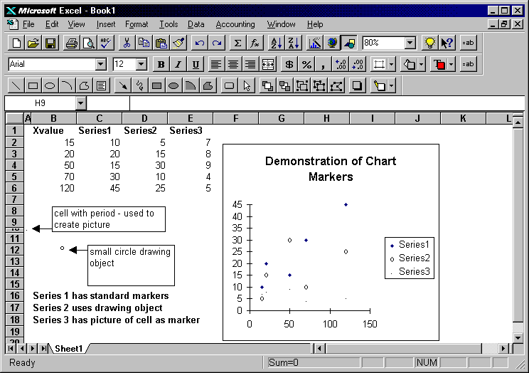
The first method uses a drawing object. As shown in the example below, a small circle created Excel's drawing tools is used to replace the standard marker. Draw the circle, copy it, activate the chart, select a data marker and choose paste. The standard markers will be replaced with the drawing object as shown below in Series2.
Another method uses a picture. In the example below a cell containing only a period is copied as a picture and used to replace the standard data labels. To copy a cell as a picture, hold the shift key down and choosse menu option Edit, Copy Picture. Select the chart and a data label and choose paste. The result will appear as in Series3 shown below.
If you have hundreds or thousands of data points, the drawing object and picture method can cause very slow re-draws of the chart. One way to speed up the chart is to use a small GIF or JPEG graphic. If you have many data points, follow these steps:
1) Click here to download a GIF image named Dot.Gif
2) Activate the XY chart and select the data series you want to change.
3) Choose menu option Insert, Picture and choose the Dot.Gif file. The Gif image will replace the data markers for the selected series.